Supplier portals must rate as one of the worst areas for UX experiences. Have you been unfortunate enough to have to use the Bravo portal or the ProContract service – horrid, yes? I can only assume they think we will jump through any number of hoops to get their business so they don’t have to care, but it is indicative of a certain mindset.
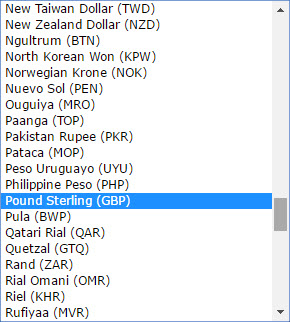
So why am I going on about supplier portals? Well I was prompted by a mailing from the ONS to sign up for their procurement notifications. It has any number of obvious usability issues e.g. 3 tabs of pages to complete that you don’t notice, error messaging above the fold and so on, but what really takes the biscuit is that they want to know what currency we want to operate in –will they really issue contracts in Qatari Rial? – and they offer you the drop down pictured above.
So I look at the top of the list expecting UK to be a default, then at the bottom of the list for UK, and then at G for GB (yes I have seen some of those) and then I scroll the whole list and it is under P for Pounds, while all the other countries are under their country name!
So presumably somebody sat down and thought this was a good idea. Amazing!
