
Over the years we have worked for a number of charities, all doing amazing things. Optimising online donation journeys is often a key objective of conducting UX research. Arguably, one of the main reasons for a charity to have a website is to generate donations. However, many make the process long winded and laborious.
Watching users navigate these donation journeys across a number of charity sites has helped us put together the below top tips for improving online donation journeys:
1. Help users decide how much to give but don’t be too pushy
Once a person has committed to donate, they need to decide how much to give. This is where many donation journeys couldbetter support their users.
Use this as an opportunity to show users where their money goes a.k.a. a shopping list! This not only offers users the opportunity to donate more than they might originally have considered but also reinforces what your charity offers.
To ensure your shopping list is effective from a usability perspective, make all ‘shopping’ options visible upfront. Do not hide options behind clicks as users will never discover these.
Example: WWF clearly display all shopping list items 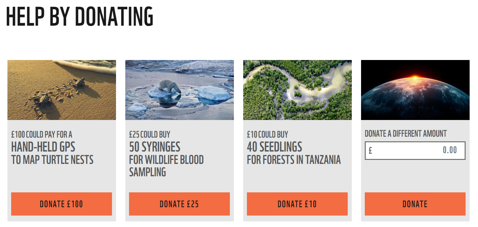
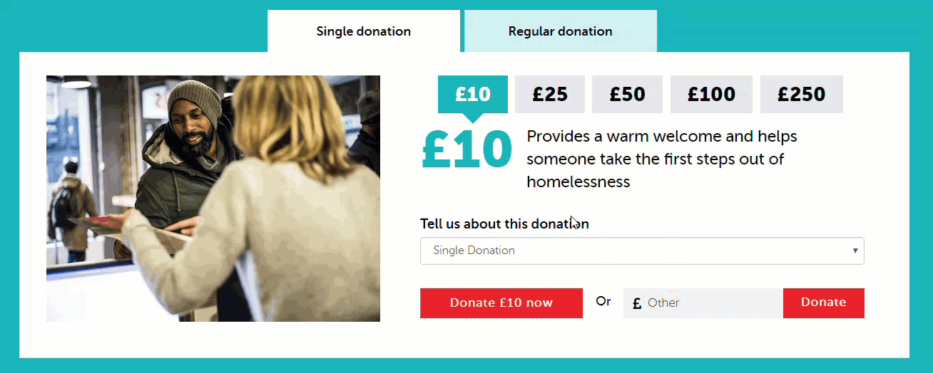
Example: Crisis require the user to click each amount to see what is on the shopping list. Many testers did not discover this.
Be careful about the amounts you choose, especially when picking larger donations. Testers have described feeling ‘bullied’ into donating more than they can afford or turned off completely by pushy messaging. A/B testing alternative amounts will help provide an indication of what works for your audience.
2. Provide ‘keep going’ messaging throughout the donation process
To avoid users dropping out of the donation process part way through, provide them with encouragement along the way. For example;
- Reinforce how much they are donating
- Clarify what their money will support
- Be transparent about how the money is spent
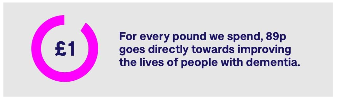
Clear graphics and images engaged testers, helped to reinforce brand messages and reassured users that they are doing a good thing.
Example: The Alzheimer's Society are transparent about how donations are spent throughout the donation process
3. Reduce the number of clicks required from start to finish
Testers are required divulge a substantial amount of personal data when completing a donation online: donation amount, giftaid preferences, name, email, address, card details and reason for donating in some cases. This causes the clicks to add up and increases the overall time users spend completing the donation process. To minimise this...
- Reduce form fields to the absolute minimum (do you really need their date of birth?)
- Ensure your form is well designed (here are some good practices)
- Auto-fill options where possible (e.g. identify card type from the number entered)
- Provide a clear address or postcode lookup
By optimising your online donation journey, you are helping your users over the final hurdle and guaranteeing their support.
However, getting people to this point, where they are happy to donate to your charity, is a whole different kettle of fish. We recommend conducting discovery user research to identify:
- What motivates people to donate to your charity?
- What key information do they need to know before considering donating?
- What content do they find engaging?
