Although qualitative usability testing is only undertaken with a small numbers of testers, there is still bags of valuable insight that can be gleaned from these sessions. Once these issues are addressed, it will not only help you improve your user experience but also increase your site success. To ensure you are getting the most from your research (and for your money), here are our tips for top analysis
1. Record your sessions
This way you can go back through the tapes to do a detailed analysis. While note taking on the day can help capture the big issues, being able to revisit the session will reveal a greater level of detail and insight into the user experience
2. Use eyetracking
Eyetracking will make it obvious which elements of the screen testers do – or don’t –see.
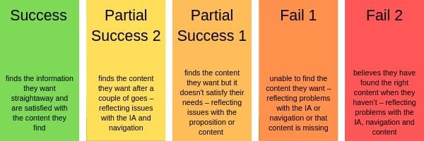
3. Review task success
Testers will usually be attempting tasks – either led by their own interests or set by the facilitator. By reviewing the success of these tasks you can get an understanding of how your site performs. We use the following categories:
4. Capture tester quotes
There is nothing more powerful than hearing issues directly from your users. Capture these quotes, either in a written report or as part of your video highlights, and share with your organisation, especially with individuals who could be a barrier to change.
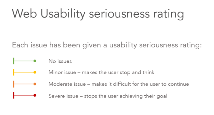
5. Rate your issues on a seriousness scale
As you begin to pull together your analysis you will notice trends. Are multiple testers encountering the same problem? Or does only one tester experience this issue? This is where you need to make a judgement as to whether it’s a major problem for the site or not. Consider the following scale: 6. Think big and small picture
Although it is important to capture all the specific issues that crop up during testing, don’t let this blind you to bigger, more fundamental problems with you site. Do people struggle to find the right content because they don’t understand your proposition in the first place? Are testers using the search function because your IA doesn’t make sense? There is little point in making lots of improvements to the interface if the proposition or underlying structure of your website is wrong
7. Never blame the testers or dismiss what they say!
When watching a tester struggle with what we would consider elementary tasks on our site, such as using a hamburger menu or clicking on the site logo to return to the homepage, it can be very easy to dismiss their attempt by saying ‘they are an exception, that’s obvious, we don’t need to change anything’. However, if you want your website to be usable by your target audience it’s important to take seriously the issues that testers encounter, even if they seem obvious.
If you are reading this blog, you are likely to work in IT or have some involvement in your website. That puts you in the top 5% of the population when it comes to technology skills (See N/Ng article). In addition, you (hopefully) understand your organisations proposition in detail and have intimate knowledge of your website, its functionality and content. Your users, on the other hand, have not and are likely to be some way down the technology skill spectrum. Doing usability testing and really listening to what your users have to say will help you overcome any internal bias that might exist and allow you to create a truly user friendly website.
Related content: What is the purpose of usability testing


