A solid information architecture (IA) is the bedrock of a good website. IA focuses on the structuring, organisation and labelling of website content to enable users, who arrive at the home page, to meet their goals and complete tasks as quickly and easily as possible.
Building a good IA requires a real desire to do things from a user perspective. Often, the organisation gets in the way of this so before you start make sure you have:
- Support from management
- A good dollop of ruthlessness
- A real desire to put the user first
Our tips for a great information architecture
- Focus on the key goals of the priority users. A website can never serve 100% of the goals of 100% of the users. What it can do it solve key goals for most of your users. These are your top tasks (a tool developed by Gerry McGovern)
- Remove unnecessary content. Once you’ve established your top tasks and key user goals, ask yourself if your content supports these. If it doesn’t, remove it. Ideally your site should have as little content as possible. And certainly no ‘vanity publishing’.
- Keep your IA narrow and shallow.
- Limit the top navigation to 4-5 sections
- Try not to exceed 7 links in each section
- But try to have at least 3 links (preferably 4) per section
- Ideally your IA should be mono-hierarchical. Each page should have a single parent to keep the structure simple. (Though poly-hierarchal does work for some sites)
- Ensure links give off good scent*.
- Each link should give off strong scent for users – use clear English and definitely no acronyms or jargon
- There should be low conflicting scent between different links. If a user has a task in mind, there should be only one option available to complete that task.
- User types and content types (with occasional exceptions) do not match user goals so do not give off strong scent. Avoid them if possible.
- Order links based on usage. Refer to your top tasks to establish this hierarchy.
- Link to web pages. Don't take users off to portal sites, external pages or PDFs from the main navigation.
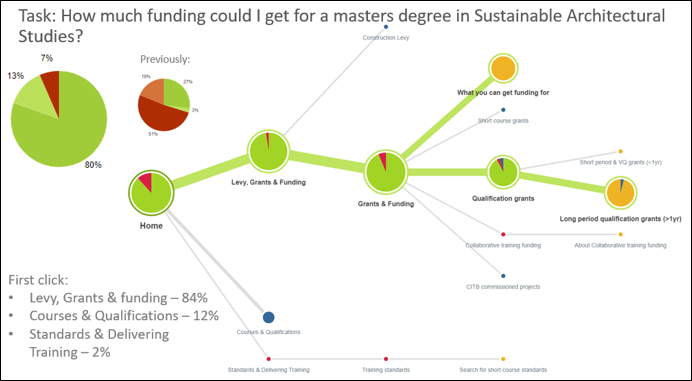
Once your IA has started to take shape, it’s time to test! Use real users and set them tasks to complete. A programme like Treejack will enable you to see when users are able to achieve their goals and when they get lost in your IA. Update, rework and test again until your success rate stays consistently above 70%. The image below is an information architecture example from a recent round of testing:

With your shiny new IA you can now begin developing your site knowing it is built on a robust and evidenced foundation. Don’t forget to protect this IA. People will try to add content that does not fit the structure. Don’t let them. We promise your users will thank you.
* What is scent? Information scent stems from the information foraging theory developed by Stuart Card and Peter Pirolli. The theory compares humans’ online behaviour to that of an animal gathering food – where there is strong scent (clear navigational labels), we will move quickly towards our prey (the information we wanted):
- Strong scent allows users to establish quickly where they need to go to achieve their goal
- Weak scent hinders users progress and they will not know where to go to achieve their goal
- Conflicting scent makes users choose between multiple options that could be what they are looking for. If they choose wrong, it will cost the user time and causes frustration.


