
Recently, we have spent a lot of time watching testers navigate their way around the smartphone apps of a well-known British newspaper. What is becoming increasingly apparent is the importance iconography has to play in a user’s experience of a site. With the growing dominance of smartphones and tablets, and the limited real estate these smaller devices offer, icons are especially important, when words will not fit. At times icons can be misleading or misunderstood but the rise in digital conventions is aiding a smoother UX experience in many mobile sites.
Conventions are common place in society; a handshake at the beginning of a meeting, a kiss on the cheek, or two if you’re French, when greeting friends. They are defined as a way in which something is usually done and help regulate and standardise our behaviour, allowing us to coordinate with one another in society.
Digital conventions are no different. They help users efficiently navigate their way around a site and set expectations of what lies behind a certain icon.
Often, conventional icons take on a skeuomorphic approach, i.e. they mirror their real world counterparts. For example, we are normally safe assuming that a little envelope means email and we know a shopping trolley or basket icon indicates checkout pages.
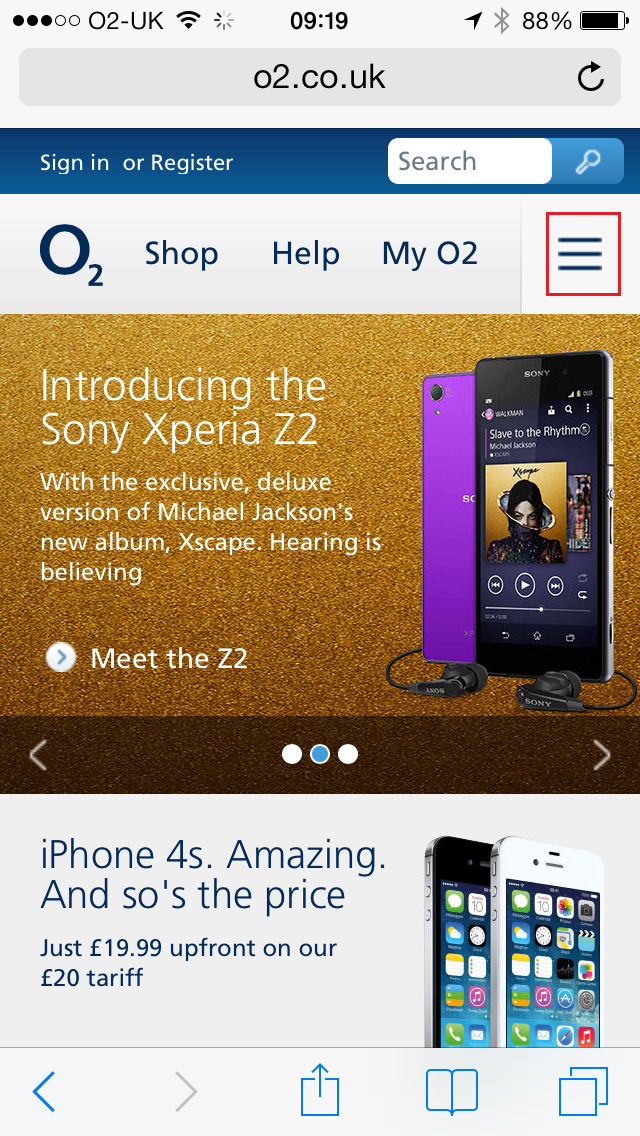
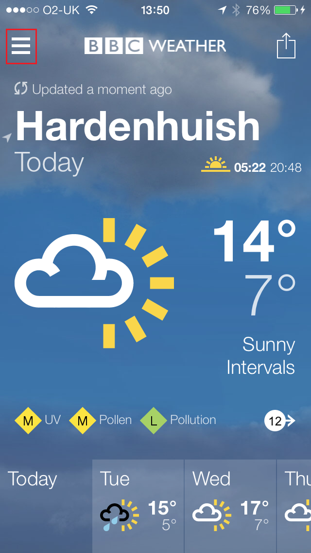
Others may not be so obvious but their prominence in the digital world has led to their growing status of conventionalism. Take the hamburger menu for instance. These three little lines are most commonly used to denote a menu as seen on Facebook and adopted by many other sites; just two examples taken from BBC Weather and O2 can be seen below.
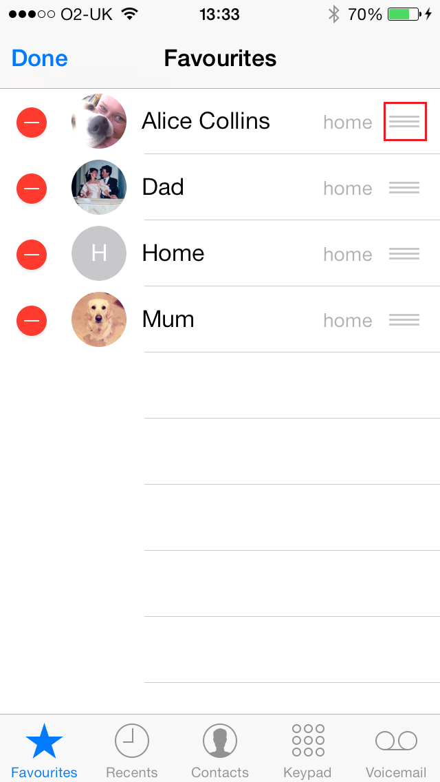
However, some like to deviate from this rapidly growing convention, in the name of innovation. Unsurprisingly, Apple’s iOS7 is one of those rebels. Their take on the three bars offers you a drag functionality, such as is found in your contact list (see picture below). This idea stems from the ‘rough’ sections found on real world objects, such as the removable back of a remote control, that help provide purchase to an action.
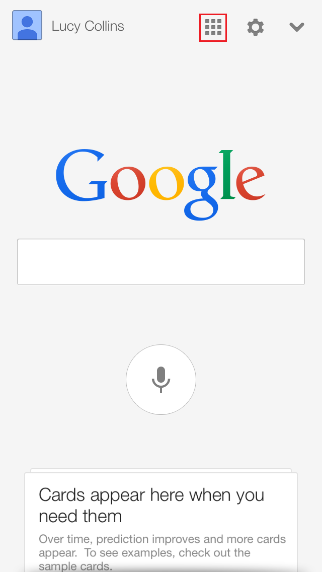
This disparity is causing serious mixed navigational messages for users and explains why some are still hesitant when tapping through to menus on mobile devices. Not helping the problem, some websites have taken to using completely different icons to denote a menu. Google, just one example, have adopted a grid icon (see above).
Our insights show that a large proportion of users are still unaware of the three lines’ significance, especially those unused to working with mobile devices or making the move across to the tablet/smartphone world for the first time. While we have no statistics to back up this claim, we would go as far as to say a third of users we have watched test sites do not understand this particular icon, demonstrating that its meaning is far from universal.
And so, to wrap this up. In our opinion, these three little lines, are streaking ahead as the market leader in conventionality where menu buttons are concerned. However, until its dominance is established, it should be accompanied by the word ‘Menu’ for added clarity. And for all those innovative individuals itching to redesign this little icon, please refrain. Convention is your friend here.
As they say, if it ‘ain’t broke, don’t fix it.
