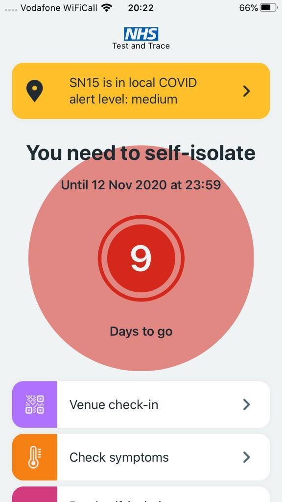
Yesterday my mum received an alert on her NHS Covid-19 app to inform her she had been exposed to someone who has tested positive and she needed to self-isolate.
What followed was a lesson in poor user experience that left her feeling stressed and ultimately distrustful of the advice she has been given.
Here’s how it went…
1. Mum receives an alert on her phone which says “The app has detected that you have been in contact with someone who has coronavirus. Please stay at home and self-isolate for 9 days to keep yourself and others safe”
2. Mum panics. For context, my mum suffers from Multiple Sclerosis and is in a wheelchair. Since the outbreak of Covid she has barely left home and encounters a very small group of people.
3. Mum opens the app to read more about the alert and what she needs to do, only to discover that the initial notification has disappeared with no option to click for further information. Instead, all she sees is a large red flashing 9, which only caused greater stress and panic.

4. Mum tries to work out when she could have been exposed and works back through her movements over the last few days. The app gives her no information to help with this process. It does not tell her where the exposure happened (because geo-location was removed), who has tested positive (because of data privacy) or when it might have occurred.
Given my Mum’s limited social contact and without any useful information to narrow her exposure down, what started as panic begins to turn into disbelief.
Nothing on the app is making her trust the information she has been given.
5. But Mum is a good, law-abiding citizen so looks to see if she can understand more about how the app works and how accurate this exposure notification might be. Unfortunately, the only information available on the app itself is a link to a generic GOV.UK coronavirus page, which offers no useful insight to this specific situation.
By the end of this process, Mum was left feeling confused, frustrated and disinclined to follow the apps advice.
What makes a good user experience?
An effective user journey has two key components:
- Can users find the information they need i.e. does the navigation work
- When they find the information does it effectively answer all their questions i.e. does the content work
Currently the NHS Covid-19 app fails both these basic requirements.
It is not clear when opening the app where users might go for more information – some elements appear clickable but are not, such as the big flashing 9, while other clickable elements do not take users to useful or relevant information.
Key content is also missing from the app, such as the initial notification and further information about how to interpret the exposure risk.
This leaves a lot of questions unanswered which is ultimately impacting negatively on how likely people are to abide by the advice they are given to self-isolate.
How to improve the NHS Covid-19 app
We believe a couple of key improvements to the Covid-19 app could increase trust and the likelihood of users following the advice it provides:
- Provide key exposure information – this needs to be visible as soon as the app is opened with the option to click through for more information on:
- How the app knows you have been exposed
- When this exposure might have happened
- What this risk of exposure means for your own health
- Make the flashing day countdown clickable so it takes users to the key information listed above – at present it just serves to alarm users.
Being told you have potentially been exposed to Covid, especially if you are high-risk like my mum, is scary.
Understanding what this risk means and pinpointing when the exposure may have happened will help reduce the fear factor, give individuals the knowledge to make an informed decision about their Covid risk and encourage them to follow the advice to self-isolate.
Read more: How COVID-19 is causing accelerated digital transformation


