Just before Christmas, my dog ate my passport.
Not only did she eat is, she completely destroyed it. To quote the guy in the Newport passport office “at least you don’t need a shredder!”
Here it is…

And here is the offending pooch…

While she was well and truly in the dog house (sorry), I was frantically on the gov.uk website to find the solution. With a trip to Norway booked for the first week of the New Year and the great Christmas shut down just around the corner, speed was key.
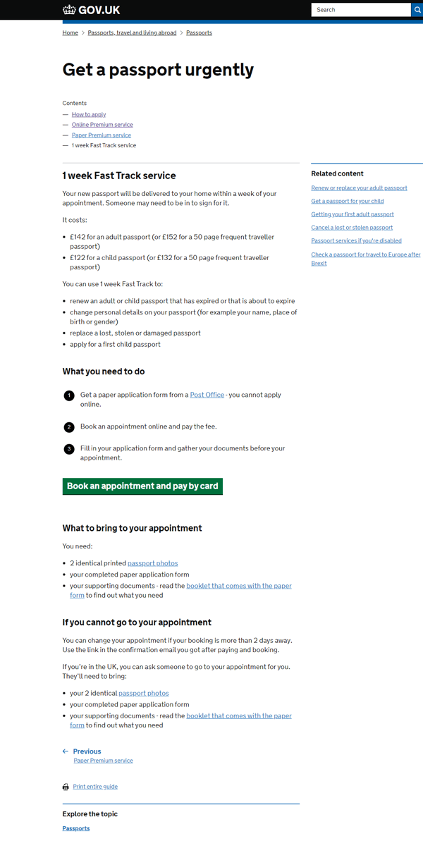
A quick Google quickly got me onto the Gov.uk website and into the 1 week fast track process. So far so good.
Over the years we have usability tested many of these government forms. Time and time again, testing with users has shown they don’t read the first page but head straight to the big green ‘Go’ button to get started. Guess what, I’m no different.
As a result, I missed some fairly crucial information towards the bottom of the page – 'what to bring to your appointment'. Perhaps not crucial at this stage but soon it would become so.

So, we dive into the process. A pretty straightforward government form, no surprises. I book my appointment to go to the Newport passport office, pay my £142 (ouch) and receive my confirmation.
Again, all pretty standard. At this point, for the first time, I see the list of what I need to bring to my appointment, which detailed the following:
- 2 identical printed passport photos
- your completed paper application form
- your supporting documents
Bullets one and two I can cope with. Bullet three, however, throws up some question marks. What supporting documents? There is no further information on the confirmation page to help shed light on this and no additional links on the page to a list of supporting documents.
At the same time, there is also a rather concerning message that warns me that without the right documents, my appointment won’t be able to go ahead.
I’m starting to worry. I like to be prepared and, given the time critical nature of this transaction, I don’t have time to turn up at my appointment with the wrong documents.
Now, if I had seen the messaging on the start page, or the same messaging was repeated on the confirmation page, I wouldn’t be in this state of confusion.

The crucial bit “read the booklet that comes with the paper form to find out what you need” had been helpfully omitted from the final page as had the link to the booklet which contained the answers I needed.
Instead of simply clicking this link, answering my questions and going about my day, I spent an additional half hour manically searching the web to try and find what might constitute ‘supporting documents’.
This set me on tenterhooks for the actual appointment – if this was my experience of their service online what would it be like in person?
But I needn’t have worried, the experience far exceeded my expectations. A 2 minute meeting followed, by a 2 day wait and my new passport arrived and is now safely stowed well out of doggy reach.
So, if HM Passport office or anyone from GDS happens to stumble across this blog, I have two recommendations to make sure your online user experience aligns with the service you offer in person:
- Users do not read the start page – they scan it then hit the green GO button. They certainly don’t read anything below that button so if that content is important, it needs to move higher on the page (that goes for any government form!).
- Give your users the resources they need to answer their questions. Not all the information needs to be provided on that same page, but where information is incomplete, links to additional content will save your users a whole lot of hard work (see our blog on the three types of help content).
Happy New Year everyone!


