
What is the best type of navigation for your website? With our 15 years of UX experience and many hours spent watching thousands of testers on hundreds of websites here are our thoughts.
To start with, what do we mean by ‘navigation’? Site navigation is made up of several elements, including include global navigation, local navigation, utility navigation, breadcrumbs, filters, facets, related links, footers, fat footers, and so on. We should note, it also includes the site information architecture i.e. how the site content is chunked and the labelled but we are not considering this in this blog.
In this blog we will focus on the main navigation. For users arriving at the home page this is the bit that allows them to reach the content they want. Our experience suggests over 90% of users will use the main navigation to find what they want. They don’t use a site search, unless the navigation does not work and most of the time they don’t browse, as they are task orientated.
This is why it is very important that your main navigation works well.
Which navigational approach works best for you, will depend on a number of things:
- what your site does
- the amount of content on your site
- how your users expect to engage with you
- the device they access the site from
Online navigation on desktop
When should I have no main menu?
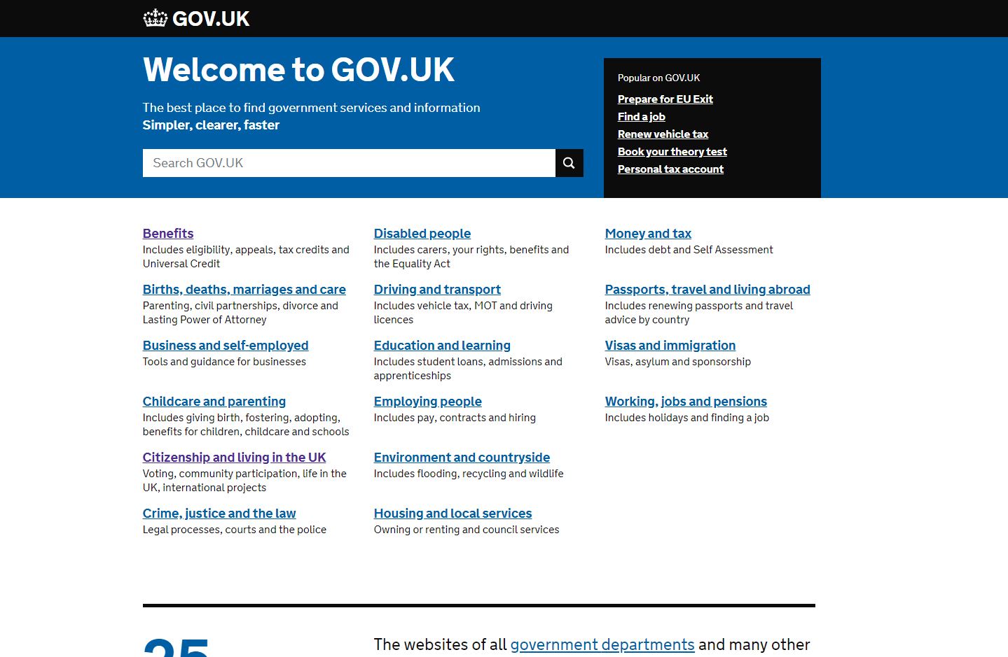
Example: gov.uk
Removing all main navigation is a great move if you have lots of content.
If your site is very content rich, it is nigh on impossible to chunk it in a logical and usable way. You are much better off dumping the main navigation altogether and investing in a search box with a great algorithm sitting behind it.
Google is the number one example of this approach. You wouldn’t dream of trying to put a navigation on the Google homepage – it would be madness!
Gov.uk may be very different to Google but it does have one thing in common – a lot of content! Launched in 2012, the site replaced over 2000 separate government website with just one. Rather than trying to chunk all their content into a usable navigation, the site presents you with a search bar and homepage links to their 16 key content areas.
Other good examples of this approach include Cambridge City Council and City of Westminster websites.
When should I use multiple menus?
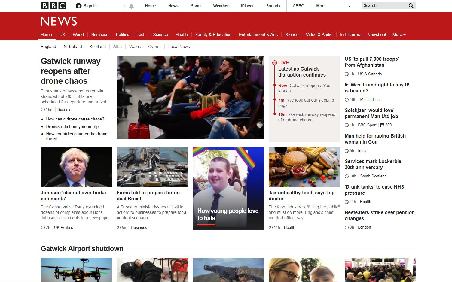
Example: BBC News
Multiple menus work well on sites that get a lot of repeat business.
This type of navigation is inherently complex. It requires you to distinguish between 2-3 different menus and understand the relationship between them. This is cognitively quite challenging the first time you come across it.
However, it can be very effective at getting users to content once they’ve learnt to use it. It’s a trade off between how hard it is to discover the functionality and how much the complexity will improve overall long term user experience.
The BBC is a classic example of the multiple menu navigational approach. Here it works because users have learnt how to use the navigation after repeated visits to the site. Additionally, users are coming to the sites to browse, rather than achieve a specific task so they will be more inclined to explore.
When should I use single level dropdowns?
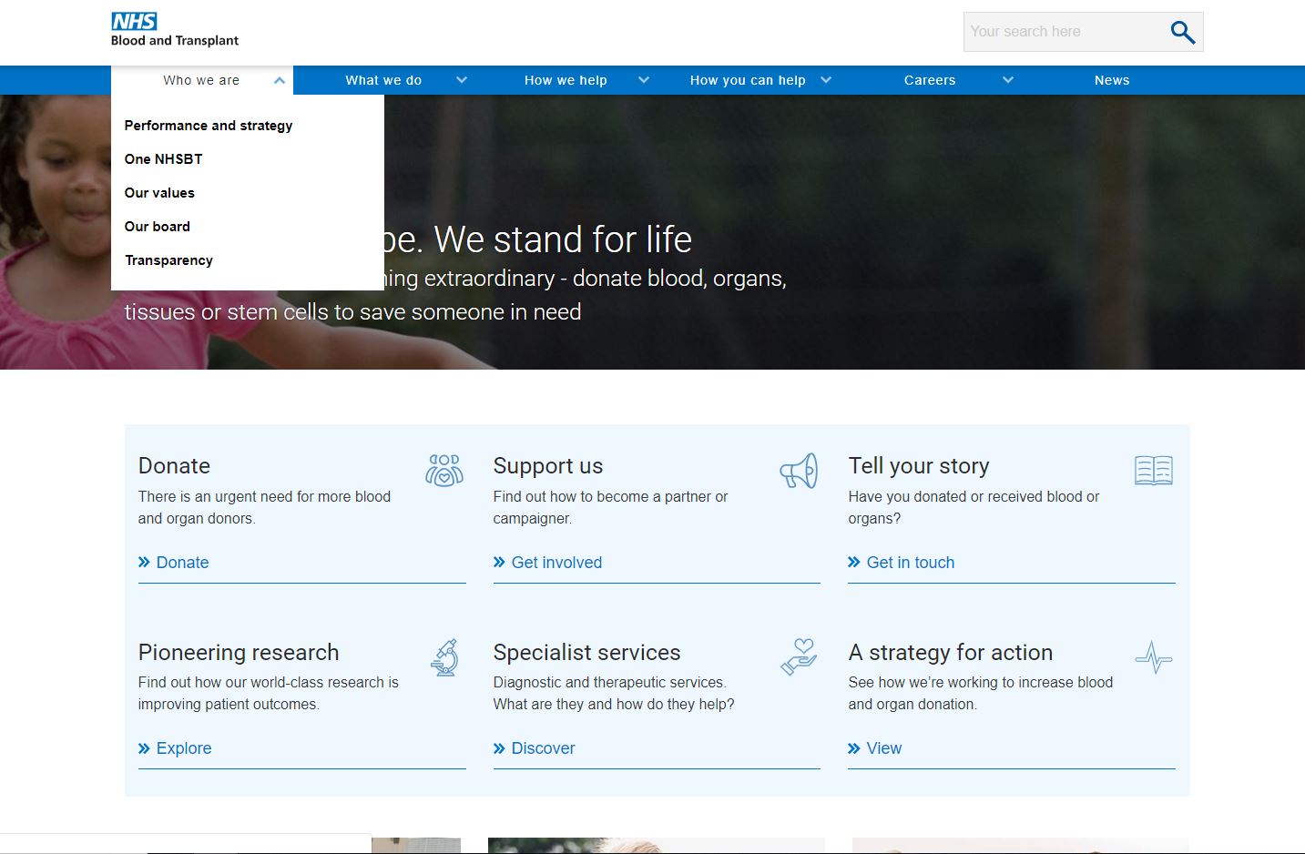
Example: NHS Blood & Transplant
In our opinion, single level dropdowns are generally not very effective and should be avoided.
This type of dropdowns shows users what they would normally expect to see on a level 2 navigation page i.e. the page that sets out the next level of the information architecture (IA) hierarchy.
The problem is, a single level dropdown gives off little scent and no brand values. An alternative and better approach is to use navigational pages. Having this additional page in the user journey does little to slow down their progress, gives off greater scent for what it to come through the use of trigger words and better conveys the site brand values.
NHS Blood & Transplant use single dropdown menus. They also provide Level 2 navigation pages. Of the two options, it is much clearer from the navigation pages what to expect from the next level of the IA.
Single level dropdowns do have one advantage over using navigation pages - users can quickly see what is in each section by rolling over the top level links. This is clearly an advantage if is not clear which top level section contains the content a user wants. However, should a user need to do this it implies the main links do not give off good scent for this task and so fixing the IA, so it works well, might be a better solution to this problem.
When should I use multi-level dropdowns?
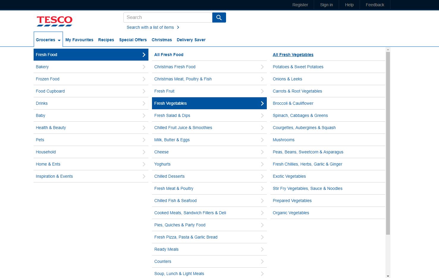
Example: Tesco
Multi-level dropdowns are useful on sites with lots of content where chunking is already well established.
Supermarkets are big advocates of this approach with Tesco, Sainsbury’s, Waitrose and Morrisons all sporting multi-level dropdowns.
On these sites, you can have a long list at each level of the IA because people are familiar with the chunking used, can scan the lists easily and predict where things will be on that list.
For example, I know from shopping in store that all bread products will be found in the bakery section – a category that is reflected within the site’s IA. I also know I will find oranges half way down an alphabetical list of fruit, so I can skip over everything above and ignore everything below.
It is important to note that this approach will only work in specialist environments, such as supermarkets, where there is existing knowledge of how this content will be structured. Under more normal circumstances when user cannot predict the content of a list more than 7 links in each section is undesirable.
When should I use mega menus?
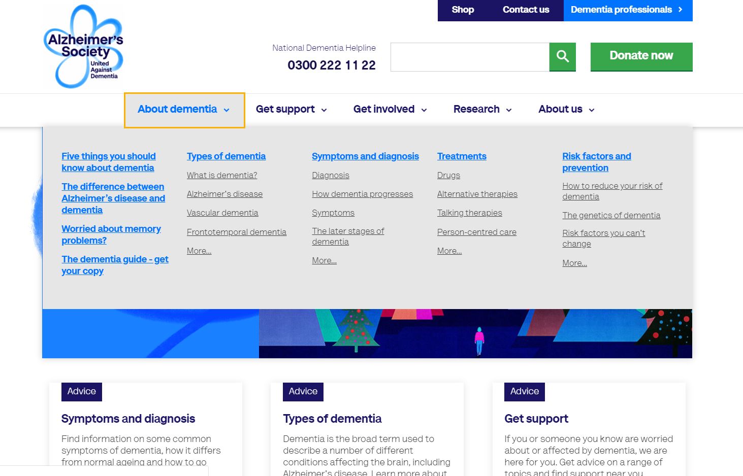
Example: Alzheimer’s Society
Mega menus are great on sites with a lot of content (but not a massive amount of content – see no menus)
Mega menus dropdown on rollover or click on the top level links, that show both the level 2’s & 3’s in the IA.
The Alzheimer’s Society are one of many mega menu examples. Activated on click, so it works on all device types, the mega menu gives clear visibility to levels 2 and 3 of the IA, grouped neatly into relevant categories. This allows users to bypass the level 2’s in the navigation and reach their goals quicker.
However, it is worth noting, even simple mega menus are quite cognitively challenging the first time you see them i.e. there is a lot of take in. On sites where users are infrequent visitors, we would recommend limiting the number of options shown – focus on your top tasks - to avoiding overwhelming your users.
Finally, in our view mega menus should only contain navigation links not promotional items. When users open a megamenu, they are task orientated and unlikely to be swayed by promotional links. So why put these in the way of allowing users to achieve their goals?
Other good examples of mega menus include Cancer Research UK, M&S and Barclays.
When should I use a Hamburger menu on desktop?
Examples: Pollen, ustwo, klinical, evolve
Our view is that using Hamburger menus at desktop screen resolutions makes it harder for users to achieve their goals.
Developed for use on mobile sites where space is limited, hamburger menus have started to creep on to desktop sites. Normally found lurking in the corner of agency and designer websites, hamburgers on desktop are the hallmark of minimalists. A quick Google of “Shoreditch design agencies” confirms this!
However, hamburger menus at larger screen resolutions are not good news from a UX perspective.
When a hamburger is present, testers will generally scroll the homepage rather than click on it. This normally offers them a random selection of stuff, so they are unlikely to find what they are looking for. If they can’t complete their goal from the homepage, they might then look for the hamburger. Overall, this will slow down task achievement rate while also showing them potentially irrelevant and unnecessary content. NB we also see the problem on mobiles but scrolling is quicker and easier on a touch screen device but it still slows task achievement.
Hamburgers on desktop are driven by design not UX. And as it is perfectly possible to have a minimalist site with a proper navigation we don’t think there is any excuse.

See more on how hamburgers harm your site from the Nielsen Norman Group
Choosing a main navigation is not an easy task. However, it is imperative that it works. Thinking about your content (do you have a lot, can it be easily chunked) and how your users behave on your site (one off visitor or frequent returners) will help you choose identify which approach is best suited to your site.
Have you considered your information architecture? This is underlying structure of your website content and should be the backbone to your navigation.
