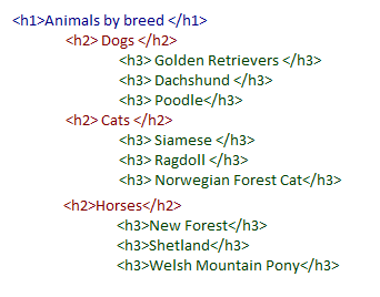
Heading elements are HTML code that help structure a web page. There are six levels of heading (<h1> to <h6>) and a list of conventions that should be followed when using them.
Why are heading levels important
HTML's hierarchy of heading elements <h1> down to <h6> is intended to tell blind screen and Braille reader users, who cannot see the screen, what the structure of the page.

This helps them to understand how the content is organised and what parent section any piece of content belongs to.
Headings are the primary means of navigation through the page for many blind people. (They will also help search engines and so be good for SEO as well).
Like sighted users, who frequently scan the headings on a page to get a quick idea of what is discussed, and to pick out sections that interest them, screen and Braille readers can do the same for blind people by:
- Allowing their users to jump from one heading to the next. (For instance JAWS and NVDA both use the “H” key for this, and “Shift+H” to go back)
- With a hot key to show an onscreen list of the headings and levels for the user to browse through and use as quick links to each heading in the page
If the h1 to h6 heading elements are not used, or are used incorrectly, then screen and Braille readers cannot perceive them as headings. This means:
- The page will be presented to blind people as one long block of text with no subject headings
- Blind people will be unable to quickly understand the structure of the page, unlike sighted users
- Screen and Braille reader users will not be able to navigate from one heading to another and decide whether they want to read a section or call up a list of headings
How to use heading levels
When choosing headings, there are some hard and fast rules that you should stick to to ensure your web pages work for screen and braille reader users.
Always make the main heading on the page an <h1>
This is like the title of a book and will be used by screen or braille reader users to discern if the page they have landed on is relevant to them.
Only use one <h1> per page
A book with two titles would be confusing. Likewise, a page with two level 1 headings is confusing and users will be unsure what the primary purpose of the page is.
Do not skip heading levels
Subheadings under the main heading should be <h2> elements; subheadings under an <h2> should be <h3> and so on down to <h6>. Skipping headings can be confusing for users as it may not be clear which content nests under which headings. Some users may also fail to surface content at lower heading levels as they will be unaware it exists.
Never choose the headings elements to achieve a desired font size
Headings are often chosen based on how they look, rather than their position in the hierarchy. While this may look good for sighted users, it completely undermines the purpose of the heading structure. Instead, choose the correct heading level and change the way it looks with styling and CSS. If you want to emphasise content that is not a heading, use bold, italics or change the font size manually.
If it looks like a heading, it should have a heading element
In contrast to the previous point, when styling your page, if you insert a visual heading, make sure it is also associated with a heading element. If you don’t, it will not be announced by assistive technologies and be of no use to blind users.
Headings are a crucial aspect of accessibility that many websites fall down on. Once you’ve got your head around headings, they are very straightforward and, compared to some accessibility issues, relatively easy to fix. Ensure both your development and content team are up to speed on heading best practice to ensure any updates to your website are accessible.
Further reading:
WebAIM Semantic Structure – Headings


