All websites should be accessible to disabled users, not only for ethical and commercial considerations, but also for legal. The Equality Act 2010 (EQA) prohibits discrimination from providers of services, good and facilities (EQA Section 21(1)). In 2011 the Human Rights Commission published a Statutory Code of Practice for "Services, public functions and associations" under the EQA explicitly stating that commercial websites are included in the scope of the EQA for the provision of services.
Falling foul of this code by failing to provide adequate access to websites not only provides a wholly unpleasant online experience for some of your users but could lead to legal repercussions.
As accessibility auditors, we see many of the same issues crop up again and again. Here we summarise some of the most common and why you need to consider them when developing your own site. Full technical recommendations are available on the W3C website.
Alternative text
Guideline 1.1.1: All non-text content that is presented to the user has a text alternative that serves the equivalent purpose, except for the situations listed below.
What is it
As the saying goes, a picture says a thousand words. On a website, images, videos or audio content may convey important information, such as what a new dress looks like or the layout of the Airbnb I am booking. They may also convey important brand messages that impact on how users feel when navigating your site.
However, not all users perceive visual or audio content and, consequently, miss out on important details to the point where the site becomes useless. Alternative text is text-based content that describes what an image or video shows. To pass this guideline, the text should do as good a job as the image or other visual content in communicating what is being shown.
How it benefits your users
- Users who have difficulty perceiving visual content can use assistive technology to read text aloud, present it visually, or convert it to braille.
- Text alternatives may also help some people who have difficulty understanding the meaning of an image, such as graphs or drawings
- Deaf users or individuals who are hard of hearing can read a text transcript of a video or audio recording and do not miss crucial information
Good practice
- Do not include ‘picture of’ or ‘image of’ in your alternative text
- For information images provide a short alt text that accurately describes what the image is. If it requires lengthy description this should be included in the site content
- Decorative images that serve no purpose should have no alternative text
- Avoid using images of text
- Functional images used to initiate actions, such as buttons and links should convey the action within the alternative text
This guideline links closely with Guideline 1.2 Time-based media.
More about how to write good Alt text from HubSpot
Use of colour
Guideline 1.4.1: Colour is not used as the only visual means of conveying information, indicating an action, prompting a response, or distinguishing a visual element.
What is it
Colour is important in web design; it highlights key information or demonstrates certain functionality. However, not all users can perceive colour. It is important colour is not used as the only way to convey information to ensure all users can access it.
For example, using colour only to distinguish an in-text link or differentiating between peak and off-peak weeks in a calendar using different colours without additional visual cues would both examples of fails.
How it benefits your users
- Users with partial sight often experience limited color vision. Some older users may not be able to see color well.
- Users who have color-blindness benefit when information conveyed by color is available in other visual ways.
- Users who have problems distinguishing between colors can look or listen for text cues.
Good practice
- When designing your site, avoid using colour on its own as an indication of information or functionality.
- Provide an alternative visual cue alongside colour. For example, underline links or use icons that clearly distinguish it as a link
- Check your contrast ratios (See more in Guideline 1.4.3 Contrast (Minimum))
![]()
Keyboard focus order and visibility
Guideline 2.4.3 If a Web page can be navigated sequentially and the navigation sequences affect meaning or operation, focusable components receive focus in an order that preserves meaning and operability.
Guideline 2.4.7 Any keyboard operable user interface has a mode of operation where the keyboard focus indicator is visible.
What is it
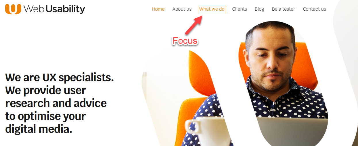
Your users need to navigate around your website so it is clear, sequential and meaningful. This navigation can be controlled with the ‘focus order’ of your website i.e. the sequence in which your users access elements of your website. It also needs to be clear which element on the page has ‘focus’ – a digital ‘you are here’.
How it benefits your users
- People with visual impairments can become confused if the tabbing focus takes them to an unexpected area of the website and prevents them from forming a consistent mental model of the content.
- People with mobility impairments relying on keyboard access will benefit from a meaningful and logical focus order.
Good practice
- Consider carefully the order users wish to navigate your site to ensure it is logical – ask them if necessary by conducting disabled user testing.
- Clearly show where the keyboard focus is. Placing a box around the link that has focus is a clear way to do this.

This blog is a summary of three common issues we see when conducting accessibility audits. For a comprehensive list of guidelines, how to interpret them and the technical requirements for compliant please refer to the full WCAG 2.1 guidelines.
Related content: Website Accessibility: Guidance and the Law


