Most of the research we do on websites is now done during the development stage: thank goodness the days of usability testing just before, or even after, launch is now in the past for the vast bulk of our clients. See User test early - Quicker, better, cheaper outcomes.
However, what is notable is that most of the time we are still only testing one option. Clients and/or their agencies go through the discovery phase, make sure they understand the business requirements, often get us to do some research to understand user goals and user journeys, and then start developing the wireframes or early prototypes.
But very quickly they home in on one version which we then test with users. I am always surprised by this. There are usually lots of different ways a web page can be configured so, if you only test one version, how do you know what would have happened if you had tested an alternative approach? Or 2 or 3 or 6 alternatives? You don’t.
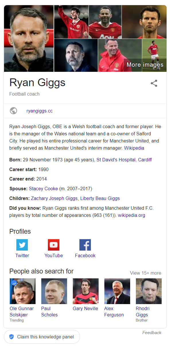
We have recently done some concept testing for a premier league football club. They were redeveloping their site search and wanted to provide some ‘rich answer’ results – as Google increasingly does – rather than just show a list of links. They knew that when users entered the name of a player they mostly wanted the latest news and gossip on him and when they entered the name of a club they wanted either details of the forthcoming match or results and highlights of the past one.

So the issue was how to best present the ‘rich-answer’ content in the most effective way. Rather than adopt their normal approach where the design agency came up with their preferred solution, we persuaded the client to let us identify and mock up various quite different solutions for testing.
We reviewed the approaches other sites use and developed a number of versions of the rich answer content – all very un-designed but incorporating all the key features. We tested these with users and got a clear steer on what did and did not work. Also, as tends to happen when testing multiple options, different bits of each approach seem to work best – often not the bits you expected. This allowed us to identify the most effective elements and combined these into the final version.
If you test one option and it does not work well you know you have to develop another version, but if you test one version and it seems OK you don’t know if there is a better approach that would work better. Testing multiple versions both shortcuts the process of finding the ‘best’ solution but also means you are less likely to implement a mediocre version.
Read more: What is the purpose of usability testing, Prototype usability testing


