
As the web has grown up, a number of user interface design conventions have established themselves.
These include:
- Main menus along the top of the page
- Company logos linking you to the homepage
- Using carousels to showcase multiple product or services on the homepage
- Prominent breadcrumb links so users can orient themselves within the site
From a usability point of view, we love conventions.
If your site follows all the expected conventions, your site will be easier to use. If you suddenly introduce new elements that require users to discover how your site works, you will slow down their journeys and ultimately could prevent them from reaching their goals.
When 15 year old Jelena came to Web Usability HQ for a week of work experience we set her the task of auditing her favourite type of websites to see how many had adopted these conventions. The industry she chose was beauty.
The audit looked at 34 sites including Boots, The Body Shop, Lush, Beauty Bay, Look Fantastic and Cult Beauty. Jelena’s key findings were:
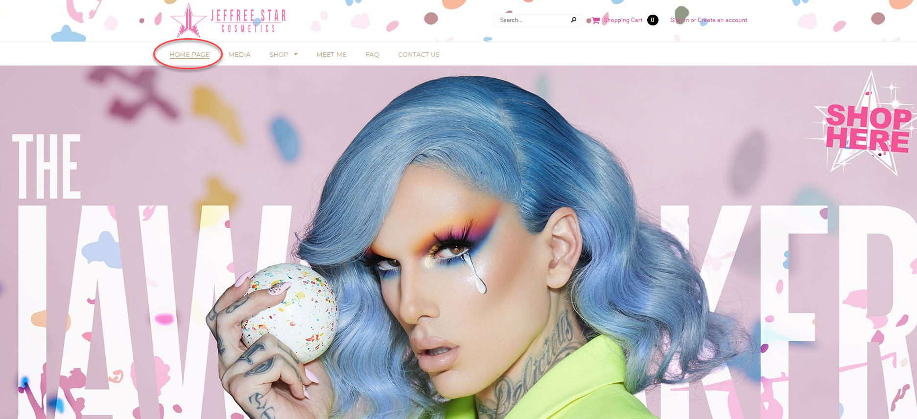
100% of sites linked their company logo to their homepage
This is a convention that is almost universally adopted these days. It is a fail-safe way for users to reset and return to the homepage. Yet, we still see many users who do not understand it. Just this week a tester said with frustration, “I don’t know how to get back to the homepage… That has been one of my problems, getting back to the homepage”. To remove this confusion, we recommend providing an explicit ‘Home’ link within your main navigation and/or breadcrumb as well as your linked logo.
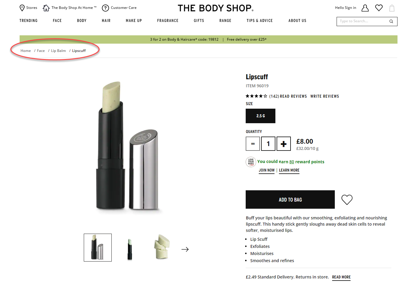
61% of websites used a breadcrumb
Breadcrumb links are the online version of a ‘You are here’ sticker. As users often enter your site via routes other than the homepage, breadcrumbs help users to orientate themselves on the site and quickly navigate to levels higher in the information architecture (IA) without having to return to the navigation pages. Ensure your breadcrumbs are clearly displayed (i.e. not lost in the clutter of a page) and big enough to click on.
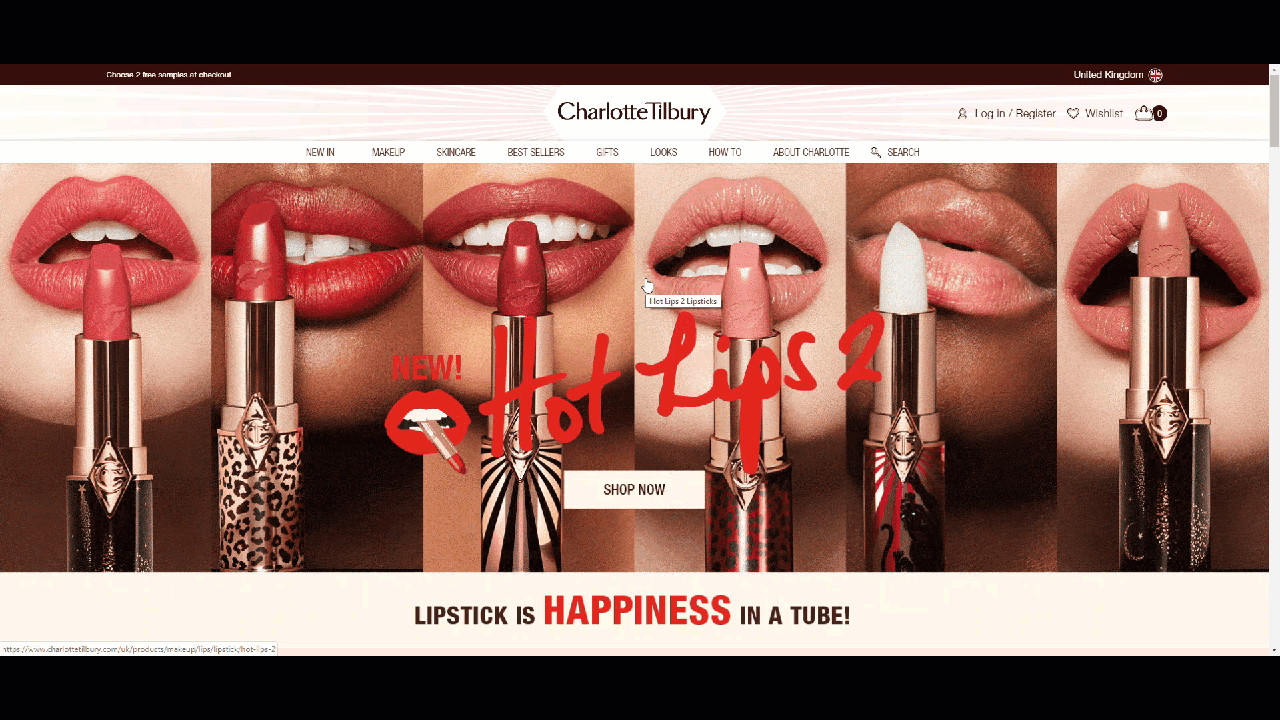
94% of websites had their navigation at the top of the page
The days of left-hand navigations are well behind us. Of the 34 sites audited, only one sported a left-hand navigation. The other 32 sites displayed their main navigations along the top of the page (while one had no navigation at all!). This type of navigation has a number of benefits – content can be full width, it limits the number of top links you can have forcing you to adopt a concise IA and it works better on responsive sites. We recommend pinning your main menu so as users scroll the page, it scrolls with them, ensuring it is always visible.
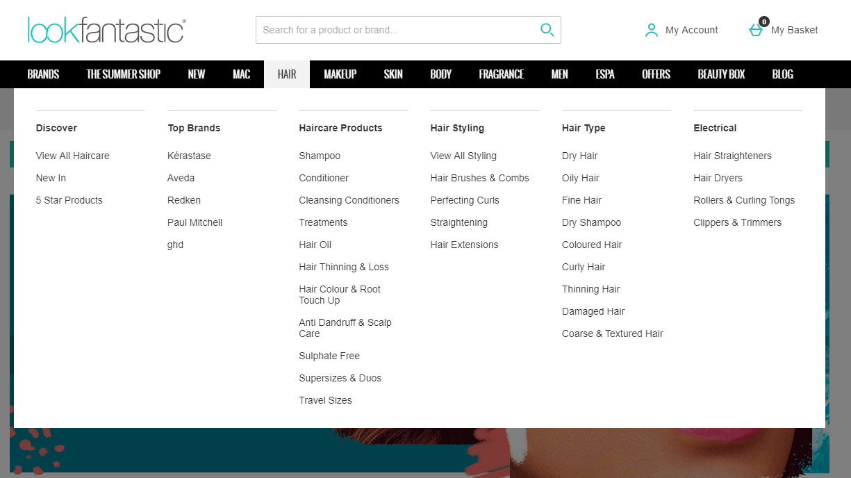
64% of sites used a mega menu as their primary form of navigation
Mega menus are great on sites with a lot of content (such as beauty websites) because they dropdown on rollover or click and show both the level 2 & 3 links of the IA. This allows users to bypass content higher in the hierarchy and reach their goals quicker.
The prevalence of these design conventions across the beauty industry is testament to their effectiveness. Conventions are not boring (no matter what your designer might think) and should be embraced in order to give your users a head start when using your website and achieving their goals.
